Making a 2021 Eurovision logo generator
How many blog posts does it take for something to qualify as an obsession? Asking for a friend. This is most likely the last post on the topic though! So please bear with me as I take you through my journey to create a Eurovision 2021 logo generator. Or don’t, you know, who am I to force you.

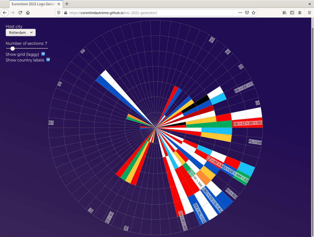
Sneak peek!
The idea of making a generator for an alternative version of the ESC logo actually dates back to last year, when I wondered if it would be possible to generate a 2020 Eurovision logo lookalike from a list of countries and their debut date (see CLEVER ° FRANKE’s lovely chart about the meaning of the 2020 logo, somewhere further down that page under the Design section, if you have no idea what it is I’m taking about). I didn’t put much thought into it before giving up and moving on, mainly because I couldn’t devise a straight algorithm that would not, at some point, be based on an arbitrary choice of shapes and colors.
The 2021 one leaves less space for interpretation. Creative decisions have surely been taken when designing it but the algorithm at its core is much simpler and easier to imitate as it’s based on objective, measurable data: locations and distances.
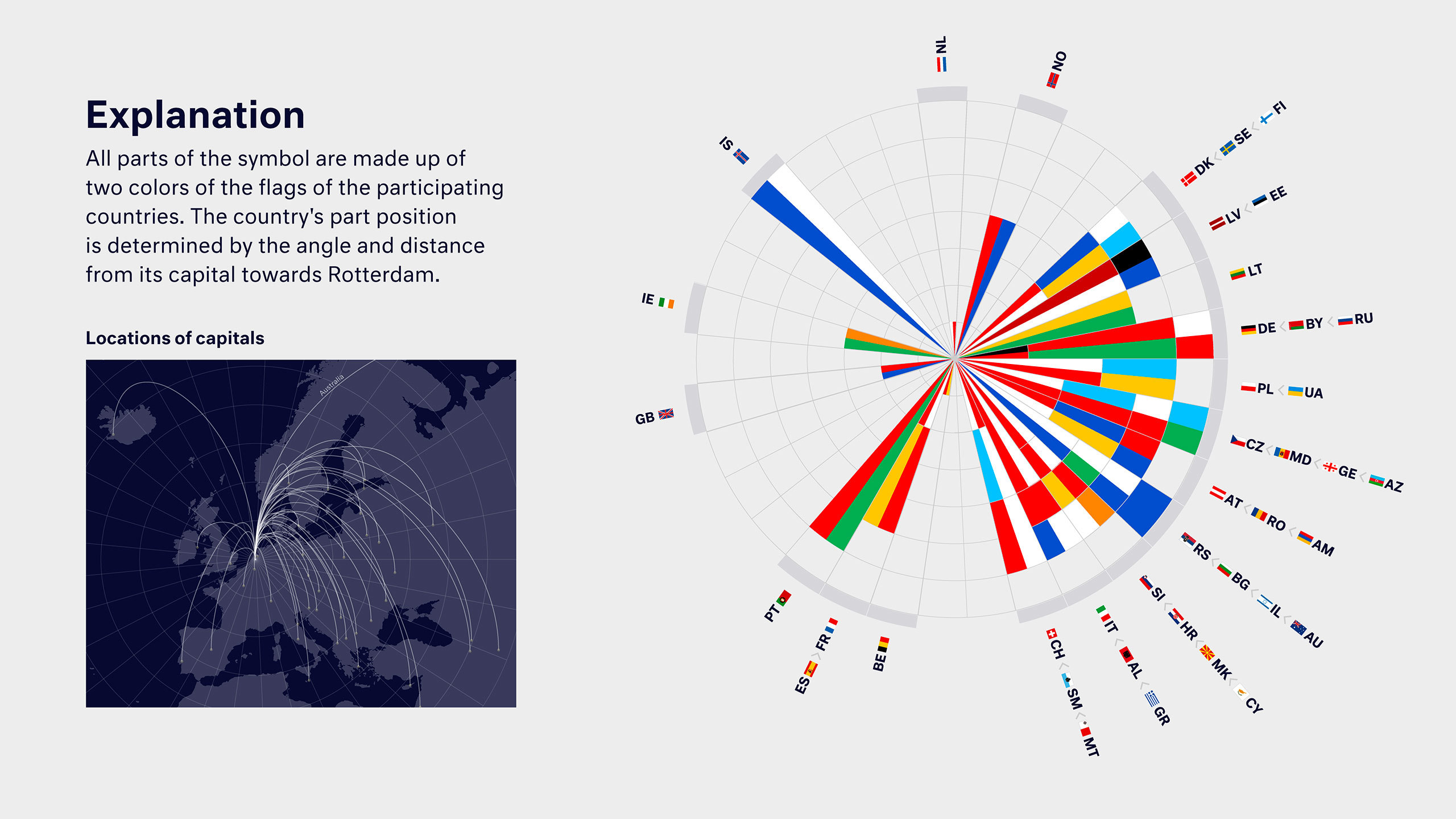
Here’s what the people of CLEVER ° FRANKE (again, see the Design section over there) have to say about the logo
Having just finished to recreate the 2021 logo in CSS, I already had a way to display the result of the generation. Which left me with the hardest bit: coming up with the algorithm that would actually generate the logo.
Every developer will have their own ritual when designing and implementing an algorithm; personally, I always start with two steps: rewording the problem (in this case, what I want is, for a list of cities, to compute the distance and orientation from each city to another specific city, and at a later stage draw and orientate colored rays on a plan), and then grab my pen and make little drawings.
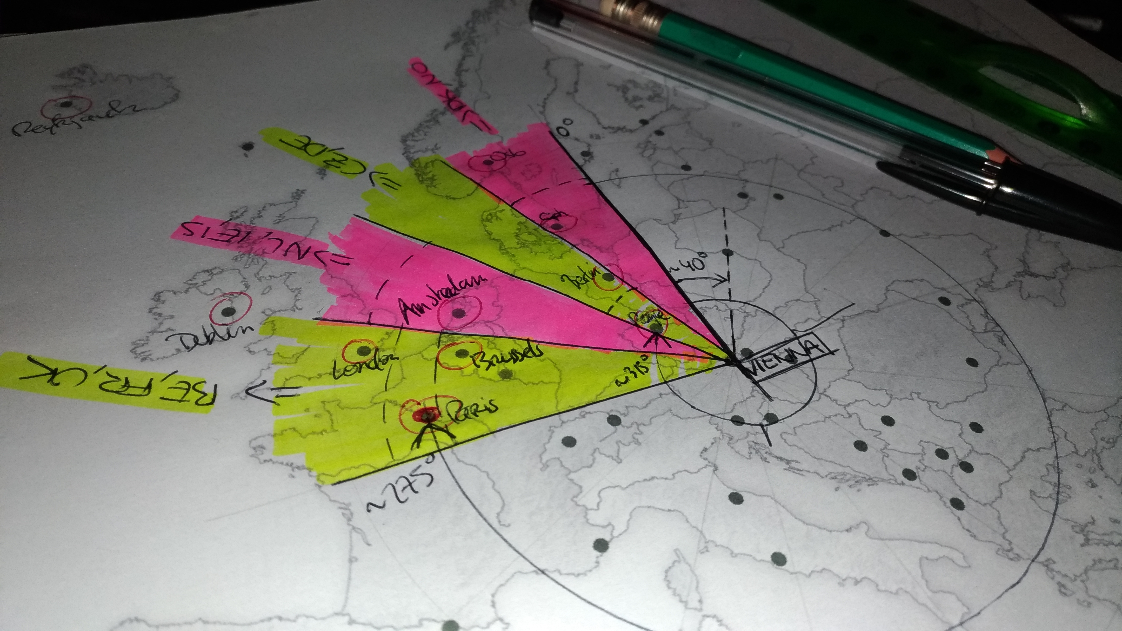
OK I went the extra mile and did something fancy here to spare you the actual unreadable scribbles and my offensively over-simplified hand-drawn map of Europe
Next up on my list was something I wanted to get out of the way fast: the math. I might be an engineer on paper, I’m still not a huge fan of math and I can’t remember any kind of advanced formula from my classes. That being said, I do remember something about calculating a distance between 2 points using their coordinates. And surely, if you can do that, there has to be some kind of witchy formula to sort of get an angle value in degrees, right? Well yes, there is, and it doesn’t take much research to find that someone asked the very same question on StackOverflow and getting a ready-to-use-ish piece of code in return.
Then comes the fun part: generating the colored slices. And there is quite a lot to unpack here.

I actually added this grid outline at the very end and that’s a shame, it would have been an helpful debugging tool
I wanted to keep the general shape of the official logo, hence this 66 slices (2 per country) grid. Next step is deciding which country ends up on which slice, which was pretty straightforward once I had calculated the angle for each capital city (that would be the code equivalent of drawing the slices directly on a map and see what capitals end up on which slice).
Then comes calculating the amount of sections on a slice and that’s where it begins to get tricky. My first idea was (again, with the aim of sticking to the design of the original logo) to keep it to 7 sections per slice and assign more or less sections to each country based on their distance to the host city. What if the distances are so large that they end up giving more sections than the 7 available you may ask? That’s fine, we simply reduce the amount of sections attributed to a country, even if that means erasing the concept of distance by giving only one section to each country. Now what if more than 7 countries get assigned to a slice?
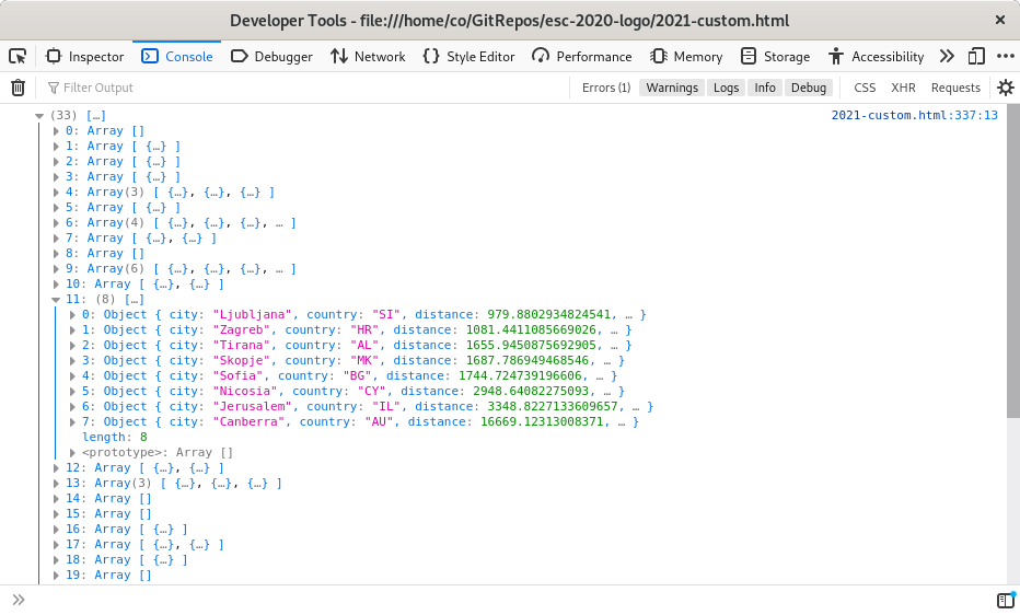
Recomputing Rotterdam, debug output – yep, that’s definitely 8 countries on that slice.
That’s a very reasonable if when you think of it, especially when this algorithm will be tasked with generating a logo for a city that’s located on, or close to, an edge of the map. I saw 2 options here: increasing the amount of sections on each slice, or moving countries to a less cluttered neighboring slide when possible. I actually went for both.
I do increase the amount of sections on the logo, but dynamically and only when needed: a hard limit of 7 countries per slice might be too short for a Reykjavik or a Yerevan, but it’s more than enough for a more central city such as Vienna. I also ended up giving the choice to the user through a slider to select the desired amount of sections. If you saw the CSS for the 2020 and 2021 logo recreations, you’ll know that this adjustment of the amount of sections comes with the need to regenerate the gradient background of the slices on the fly, but that works rather well (although, my slices being styled through a pseudo-element, it required me to insert a new style block at the top of the HTML document – not the cleanest but it gets the job done).
I could have stopped here and be fine with 9, 10 or 11 section long slices, but I found that the generated logos look better when compact and I chose to give the idea of shifting countries around a try. The algorithm I wrote for this isn’t particularly smart but it’s efficient enough to my liking: I iterate over all the generated slices of countries, and when finding one that contains more countries than the chosen slice size, I move countries to the preceding or following slice (starting with the ones that are closer to the “target” slice based on the angle value computed earlier).
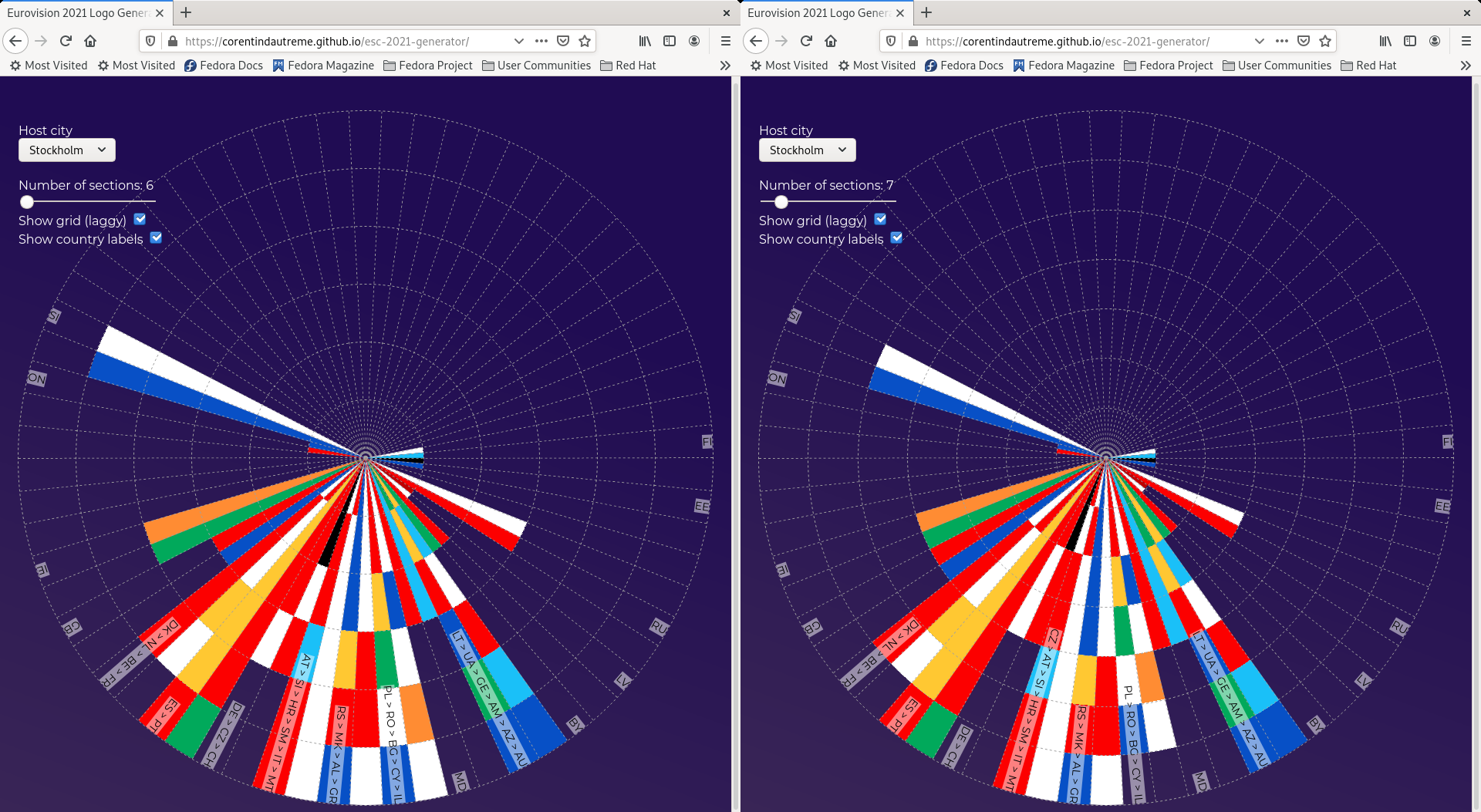
A Stockholm-based logo technically requires 7 sections on each slice for every country to fit (right), but a 6-section version is working just fine simply by moving Czechia to the next slice (left)
There isn’t much more to it. The last step was to add a few inputs (i.e. for the host city selection) and a couples display options (such as showing the countries of each slice on a label which, now that I think of it, would also have been a killer debugging tool while working on this) and Voilà! If you missed the link earlier, you can give this thing a try yourself right here. The full code can also be found over there.
