Recreating the 2020 Eurovision logo using CSS
(Yes, I’m sneakily backdating this article as it’s not exactly new, although rewritten especially for this new lil cosy blog)
The visual theme is what makes each Eurovision different and I’m always super curious to see what the next creative team is going to come up with. I was at first unsure about the 2020 (and as we now know, 2021) logo, but it quickly grew on me and that’s most likely because of what it represents. See, it’s not just a logo, it’s data. And if there’s one thing I like more than design, it’s a beautifully crafted data vizualization.
And to me, aesthetically pleasing data is meant to be recreated using CSS.
And that’s what I did! (view a demo on CodePen)
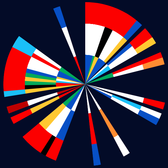
Tadaaaaaaa yes I got the height of each colored section slightly wrong ignore that please
I’m no designer and even less of a frontend expert, so I didn’t have much clue on where to start. I began with playing around with shapes and see what I could by stacking a bunch of cones, but that wasn’t exactly a success and I let the idea rest thinking I’d maybe come back to it another day.
And a week or so later I got another idea - what if this logo wasn’t a bunch of cones but a piechart? I mean sure, a weird piechart with multiple colors on each section, but a piechart anyway?
And so I had a sarting point. But still, back to square 0: I don’t speak CSS very well, so creating a piechart from the ground up wasn’t going to be possible. Luckily, I knew a friend.
Or, to be more accruate, my friend knew a friend. This article is everything I was looking for - brilliant! I’m not going to be rude and paraphrase someone else’s work so I strongly recommend suggest you read to article for more details, but after playing around for a little while, this is what I managed to get:
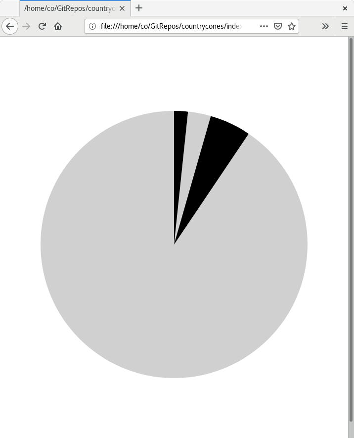
Step 1! Believe in it! And… draw tiny black sections?
Here’s the code which is, for the time being, nothing more than a complete rip-off of what our friend (well friend of a friend) from the aforementioned article did:
<style type="text/css">
    .circle {
        width: 540px;
        height: 540px;
        margin: 150px auto;
        position: relative;
        overflow: hidden;
        border-radius: 100%;
        background: #d0d0d0; /* for visibility */
    }

    .slice {
        width: 100%;
        height: 100%;
        position: absolute;
        overflow: hidden;
        transform: translate(0, -50%) rotate(90deg) rotate(calc(var(--offset, 0) * 1deg));
        transform-origin: 50% 100%;
    }

    .slice:before {
        width: 100%;
        height: 100%;
        background: #000;
        content: '';
        position: absolute;
        transform: translate(0, 100%) rotate(calc(var(--value, 45) * 1deg));
        transform-origin: 50% 0;
    }
</style>

 <body>
    <div class="circle">
        <div class="slice" style="--offset: 0; --value: 6;"></div>
        <div class="slice" style="--offset: 16; --value: 18;"></div>
    </div>
</body>
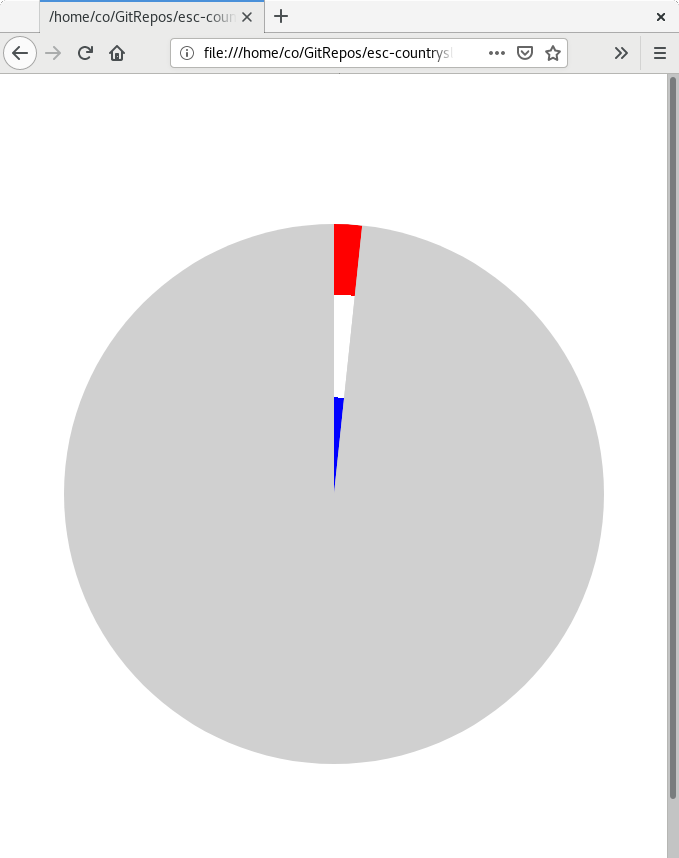
Next up - colors! Thankfully the pattern was simple enough to reproduce, with each slice being made up of exactly 3 parts of equal height. Before adding the colors, let’s take a step back and remove the overflow: hidden on both the .slice and .circle classes. If you haven’t read the css piechart article I’ve linked earlier (and you should!), this is what happens behind the scenes: we use the :before pseudo element and rotate it just enough to make it fit in the actual slice element. Hiding the overflow helps making it look clean and sharp.
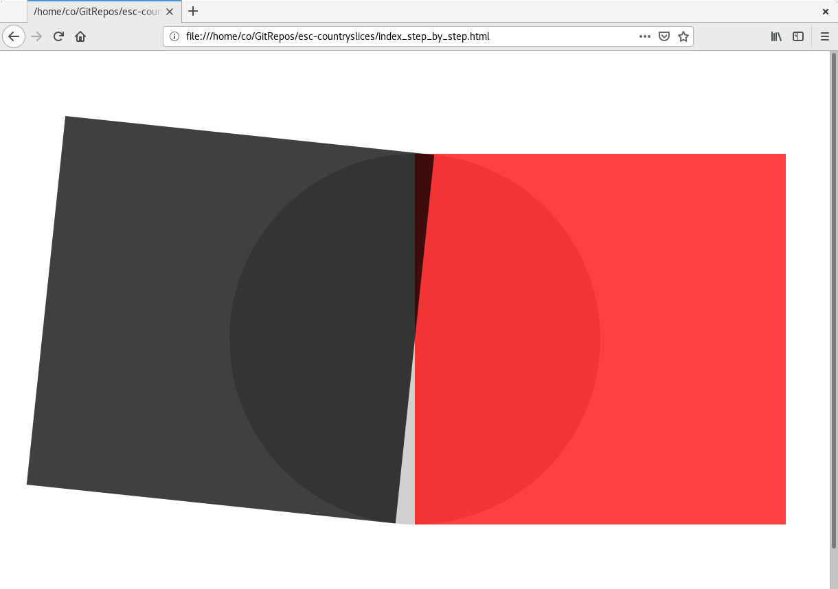
The red square is the visible area (the actual .slice element), and the black square is the content. The part of the black square that overlaps with the red one is what we see in the end.
Now onto the colors. This involved playing thinking about angles and rotating imaginary things in your head and I’m worse at that than I am at CSS, so keeping a piece of paper in reach is a life-saver. The idea was to use a radial-gradient and get it to originate from the right place on the :before pseudo element so it would look right. And after a looooong period of trial and error (I found that the middle of the right edge works perfectly), hurray! It works!
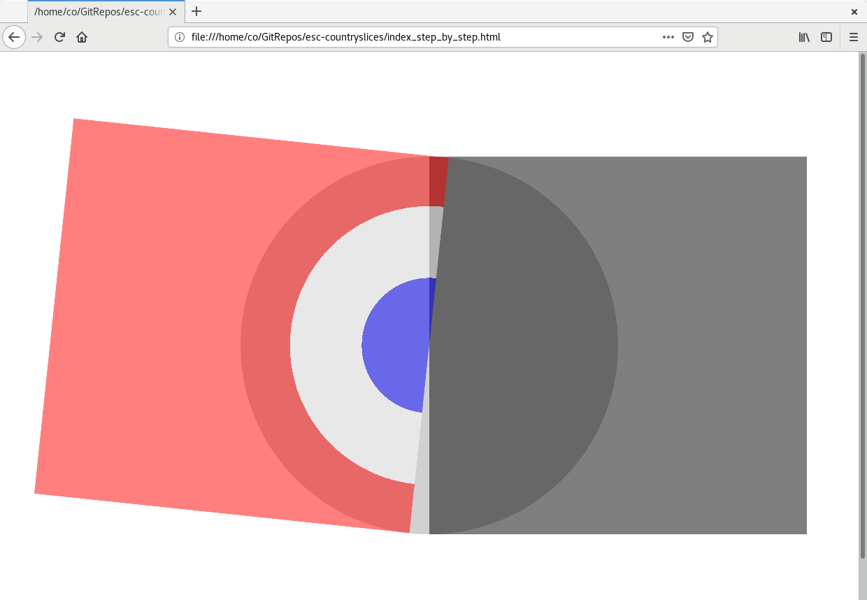
Yes I’m an uninspired patriotic idiot
It’s alive!
Here’s the gradient’s CSS by the way:
background: radial-gradient(50% 50% at 50% 0,
    var(--color1, white) 0,
    var(--color1, white) 33.3%,
    var(--color2, white) 33.3%,
    var(--color2, white) 66.6%,
    var(--color3, white) 66.6%,
    var(--color3, white) 100%
);
One last thing - extracting the real colors from the logo and recreate every slice. Don’t try this at home, that wasn’t fun. Full list below if you’re interested (click on “Click me!”).
Click me!
All slices (one by line), clock wise, colors are inner to outer.
    #0750c6 #fff #fc0000
    #01aa5a #fff #fc0000
    #ffc832 #000 #fc0000
    #0750c6 #fff #fc0000
    #0750c6 #ffc832 #0750c6
    #000 #0750c6 #fc0000
    #1ac0f8 #fff #fc0000
    #1ac0f8 #fff #ffc832
    #01aa5a #fc0000 #fc0000
    #01aa5a #fff #ff8c32
    #fff #fff #fc0000
    #fff #1ac0f8 #fff
    #0750c6 #fff #0750c6
    #fff #ff8c32 #fff
    #fff #fc0000 #0750c6
    #fff #0750c6 #fc0000
    #0750c6 #fff #000
    #0750c6 #fff #fc0000
    #01aa5a #ffc832 #fc0000
    #fc0000 #ffc832 #fc0000
    #be0000 #fff #be0000
    #ffc832 #ffc832 #1ac0f8
    #fc0000 #000 #fc0000
    #fc0000 #01aa5a #fc0000
    #1ac0f8 #ffc832 #fc0000
    #fff #01aa5a #fc0000
    #ffc832 #0750c6 #fc0000
    #0750c6 #fff #fc0000
    #01aa5a #fc0000 #1ac0f8
    #01aa5a #fff #1ac0f8
    #fc0000 #fff #0750c6
And that’s pretty much it! The rest was all about guessing the correct width and position of everything. You can find the final version of the code on CodePen.

Here it is again because I’m a show-off - who ends a technical demo without the final result anyway?